Alecta
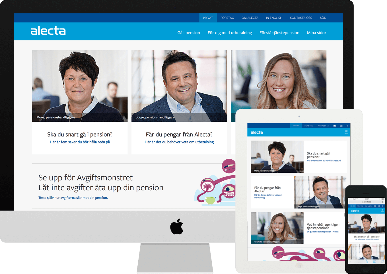
New website with the goal of making occupational pension surprisingly easy to understand.

Background
Alecta is the fifth largest occupational pension provider in Europe with over 2.4 million private customers and 34 000 corporate customers. Together with another UX Designer I worked on a project involving marketing, communication and IT.
About the project
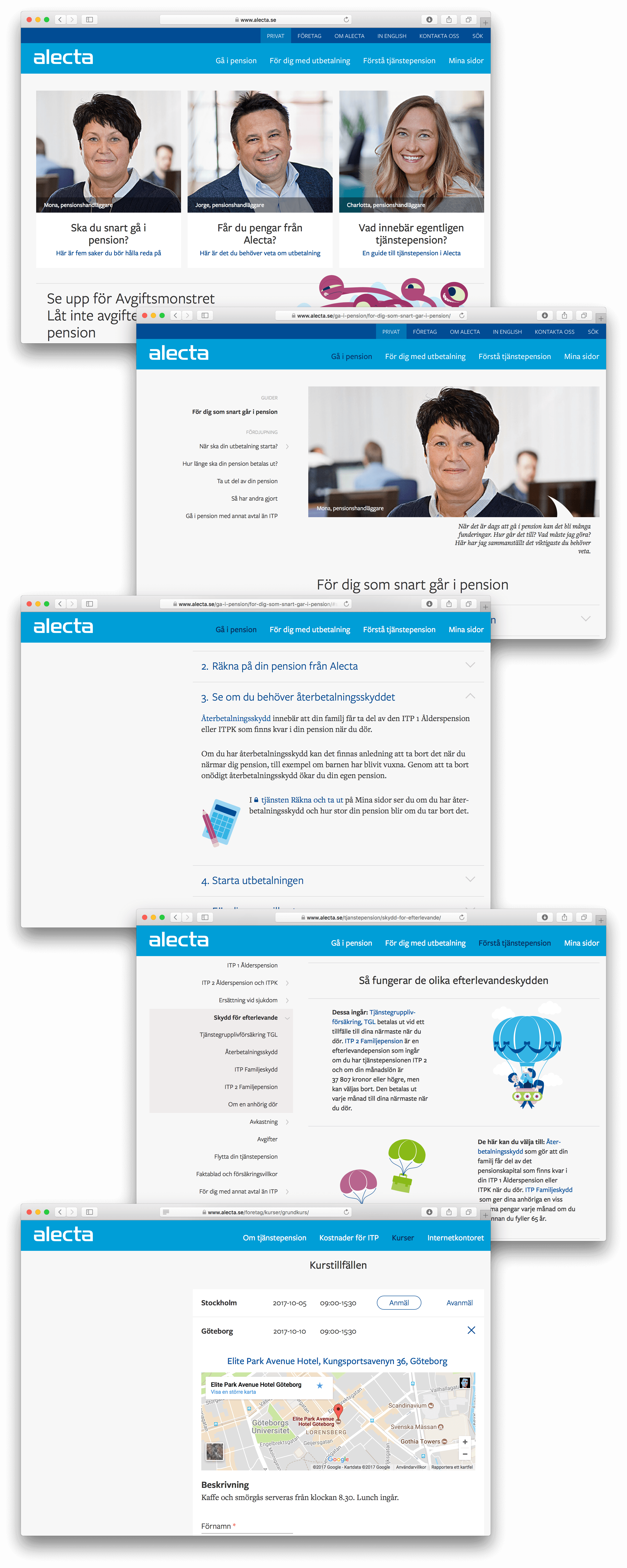
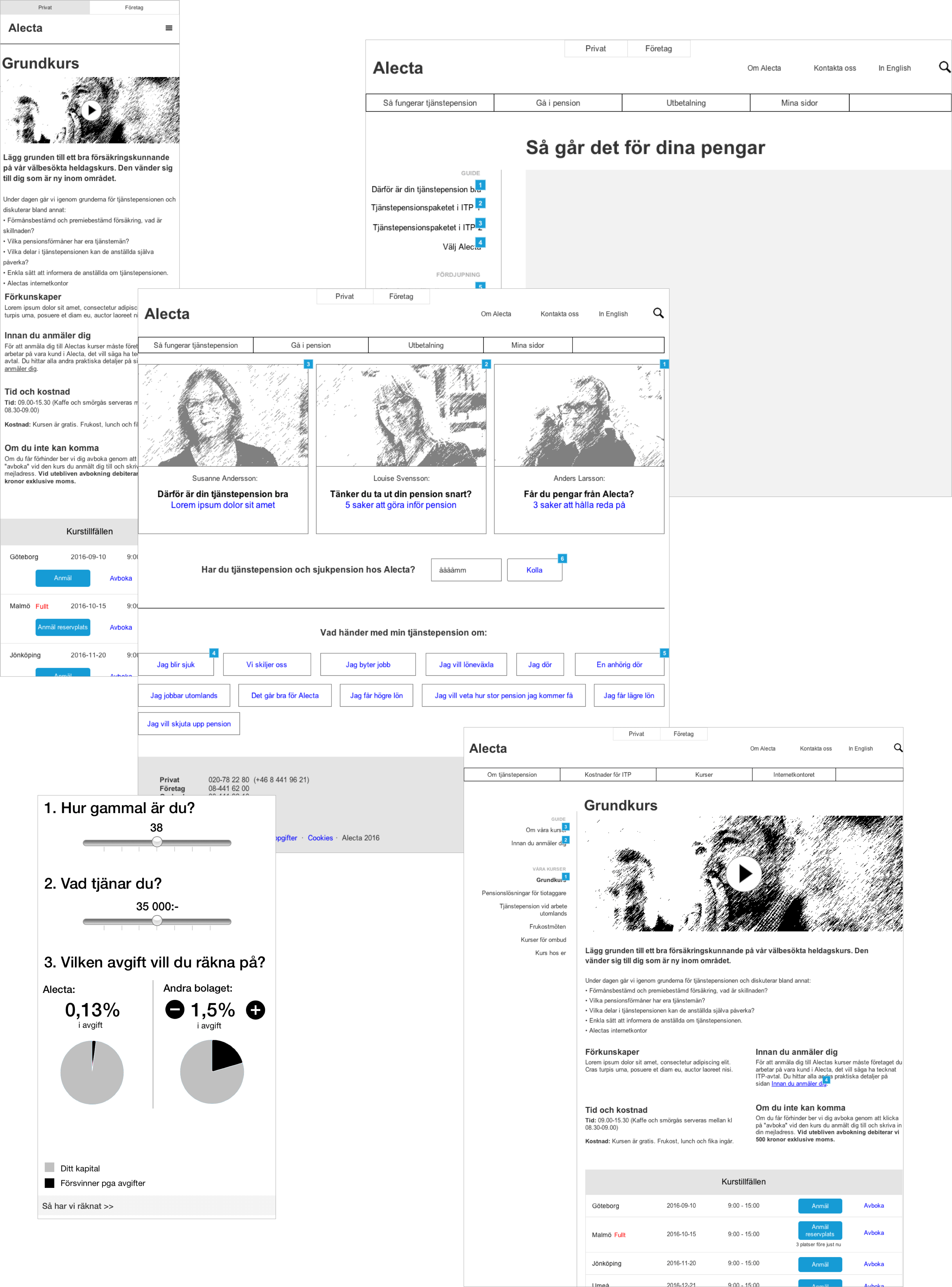
I entered the project after a business impact map and an initial concept had been established. Together with another UX Designer I continued the work and iteratively designed page templates, modules etc and also planned and conducted various forms of usability tests along the journey.
To simplify both the project and future development and refinement, an interactive style guide was also designed and developed.
I also supported and coached Alecta’s in house web team about user centered design methods for building and maintaining modern responsive web solutions.
Result
A website explaining a complicated topic in a straight forward way regardless of what device the customer is using.
- Company
- Alecta
- Website
- www.alecta.se
- Industry
- Finance
- Year
- 2016-2017
- What I did
-
- Low fidelity to high fidelity prototyping
- Planning and conducting different types of user tests as well as procurement of outsourced user tests
- Accessibility strategy
- Style guide


 Live playback of one test participant trying to solve a scenario during one of the user tests. (Hand anonymized.)