Making resource finding easier at Uppsala University Library
How the website could better display resources for students and researchers.

One of the tasks in the module “Design and Analysis of Human-Computer Interfaces” during my Master in HCI was to help the University Library in Uppsala with their web redesign. My group worked on a task called “Visualization of resources and services”.
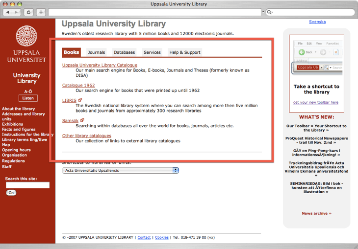
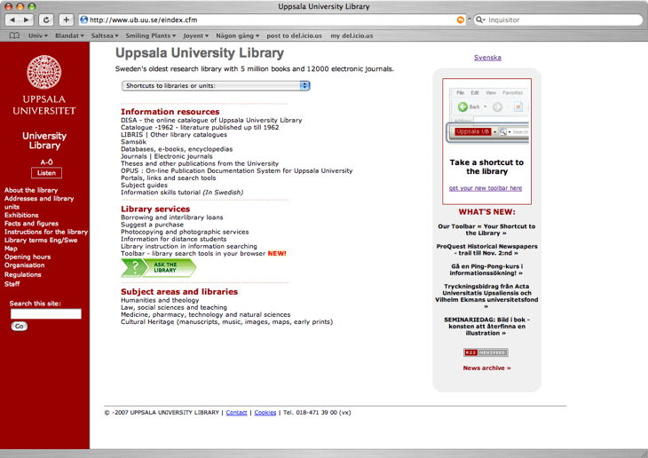
Going from an unclear and compact structure (below) to a goal oriented and a more esthetic pleasing and readable design (above), I think we succeeded in our prototype work.
- Company
- Uppsala University Library
- Website
- (Project no longer online)
- Industry
- Internet
- Year
- 2007
- What I did
-
- Interaction Design
 How the resources were originally presented